Pop Art started in Britain during the mid-1950s. The term Pop Art revolved around “discussions among artists who called themselves the Independent Group (IG)”(Gersh-Nesic). The Institute of Contemporary Art in London, began around 1952–53. Pop Art is an appreciation for popular culture, or what we also call “material culture.” It does not “critique the consequences of materialism and consumerism; it simply recognizes its pervasive presence as a natural fact”(Gersh-Nesic). Pop art was a response to “clever advertisements and building more effective forms of mass communication (back then: movies, television, newspapers, and magazines)” and its “galvanized energy among young people born during the post-World War II generation”(Gersh-Nesic). The Pop art movement rebelled ”against the esoteric vocabulary of abstract art, they wanted to express their optimism in a youthful visual language, responding to so much hardship and privation”(Gersh-Nesic). It was a celebration of the “United Generation of Shopping”(Gersh-Nesic). Based on my research, Pop Art is said to have “completed the Modernism movement in the early 1970s”(Gersh-Nesic). Additionally, it also ended the Modernist movement by “holding up a mirror to contemporary society”. Did you know that Spanish artist Pablo Picasso used “the same strategy”(Gersh-Nesic)? He made light of “our love affair with shopping by creating a woman out of a label and ad from the department store Bon Marché”(Gersh-Nesic). However, Au Bon Marché (1913) is not considered the “first Pop Art collage”, but “planted the seeds for the movement”(Gersh-Nesic). Pop art was even used during the Dada era. Dada artist Marcel Duchamp “pushed Picasso's consumerist ploy further by introducing the actual mass-produced object into the exhibition: a bottle-rack, a snow shovel, a urinal (upside down)”(Gersh-Nesic). He called these objects “Ready-Mades”, which was an “anti-art expression that belonged to the Dada movement”(Gersh-Nesic). Furthermore, Pop artists followed Duchamps' lead in the 1950s by returning to imagery during the height of Abstract Expressionism and purposely selecting "low-brow" popular imagery” and included 3-dimension objects(Gersh-Nesic). There are several characteristics that art critics use to define pop art which include:
Recognizable imagery, drawn from popular media and products.
Usually very bright colors.
Flat imagery influenced by comic books and newspaper photographs.
Images of celebrities or fictional characters in comic books, advertisements, and fan magazines.
In sculpture, an innovative use of media.
PopArtistsandTheirWork
Andy Warhol:
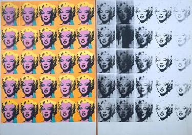
Marilyn Diptych, by Andy Warhol in 1962
Marilyn Diptych Background
The medium for this piece is silkscreen ink and acrylic paint on two canvases. Warhol made this piece of Marilyn Monroe because she "was already a familiar subject" following her death in August 1962 (Tate). Warhol used a publicity photo from her 1953 film "Niagara as the source image" and copied it 50 times(Tate). Warhol uses an impersonal image one in which already existed made for "mass reproduction"(Khan Academy). According to Khan Academy, Warhol references the painting Diptych with the Virgin and Child Enthroned and the Crucifixion, 1275/80 (Khan Academy). It is a form of Christian painting that "invites us to worship the legendary icon, whose image Warhol plucked from popular culture and immortalized as art"(Khan Academy). You can see the use of "two contrasting canvases for Marilyn Diptych"(Tate). It illustrates the "contrast between the public life of the star" and her private life (Tate). This is because she was deemed at the time, "one of the most famous women alive"(Tate). The contrast was"not necessarily Warhol’s intention"(Tate). We know the image of Marilyn Monroe is a photo, not only because of its "verisimilitude", but also because of "the heightened contrast between the lit and shadowed areas of her face"(Khan Academy). We recognize her seductive expression though the repetition "remakes her face into an eerie, inanimate mask"(Khan Academy). Warhol’s use of the silkscreen technique “flattens” her face (Khan Academy). Warhol removes the "gradual shading that creates a sense of three-dimensional volume, and suspends the actress in an abstract void"(Khan Academy). He "transforms the literal flatness of the paper-thin publicity photo" into an emotional “flatness,” and "into a kind of automaton"(Khan Academy). Furthermore, this painting "demands our attention and announces the importance of the subject matter"(Khan Academy). It is through "the careless handling of the paint and its “allover composition”—the even distribution of form and color across the entire canvas, such that the viewer’s eyes wander without focusing on one spot" (Khan Academy). These were "hallmarks of Abstract Expressionism, as exemplified by Jackson Pollock's drip paintings"(Khan Academy).
Skulls, by Andy Warhol 1976
Skulls Background
The medium used to create Skulls are acrylic paint and silkscreen on 6 canvases. This piece was created in Warhol's famous New York studio. He took the 6 canvases and put them vertically so that it displays "three rows of two"(Tate). Each panel reproduces the same "image of a human skull resting on a flat surface and seen from a slightly raised point of view"(Tate). The "black and white photograph on which Skulls is based was taken by Ronnie Cutrone, then one of Warhol’s assistants"(Tate). Cutrone positioned the skull on a "trestle table, resting it on a piece of plywood covered in white paper in front of a blank studio wall"(Tate). Warhol instructed them to take several photographs while switching up the positions so there was a variety of light sources for dramatic shadows. A synthetic polymer paint was used as an alternative to oil paint because it is fast drying. This was used as the background. According to Tate, the "vivacity of the red, yellow, blue, and purple colours used here is at odds with their macabre subject matter"(Tate). Some art historians claimed that Warhol’s "repeated use" of the skull as a "motif in his work of this period to the artist’s near-fatal shooting in 1968"(Tate). However, others have suggested that Warhol’s interest in the skull as a motif "stemmed from his desire to evoke the human condition"(Tate).
The Warhol Artistic Aesthetic
Pop art is one of my many favorite genres of art. Andy Warhol also happens to be one of my favorite artists. I love his intention of taking an image and repeating it numerous times playing on "mass production". In Marilyn Diptych, he embodied Pop art, first by using a face that was already familiar like Marilyn Monroe. Secondly, the use of vibrant colors. What is so interesting about this repetition is that each one is slightly off or different. On the left side where it is the most colorful you see how in the first two columns Marilyn's face appears very softly shading and goes into a more harsh darker shading around her face outline. As far as the emotional spectrum the right side of the painting does have an eerie feel. If this is supposed to illustrate her public life and private life. The assumption I made about the image is that on the outside "publically" there's the facade of being happy and beautiful but deep down inside there's a darkness that resides "privately". I consider it a private battle especially knowing how she passed away and it shows in this painting as you see images of Marilyn fading on the black and white side.
In the painting Skulls, to me it is very detailed.You can see the thick lines of the teeth and the shadows of the skull. This painting much like Marilyn Diptych each image is slightly off. The bottom left skull position is facing more towards the audience than one above it. This could be done purposely or just the illusion from the repetition and the colors not being perfectly painted onto the image.
Roy Lichtenstein:
Drowning Girl, by Roy Lichtenstein in 1963
Drowning Girl Background The medium used for this painting is oil on canvas. It can be found in the Museum of Modern Art (MoMA), New York City, NY, US. Drowning Girl is considered one of the most famous paintings of Roy Lichtenstein. It was based on the cover of the "1962 comic book Run for Love by DC Comics"(MoMA). Lichtenstein altered the original illustration of the girl drowning in the "foreground with her boyfriend in the background clinging to an overturned boat"(MoMA). He crops the boyfriend out completely so the girl is the main focus of the painting. The narrative text in the illustration presents a "melodramatic love story"(MoMA). In the original work the girl is drowning "because of a leg cramp, but she is so grief-stricken that she decides to drown instead of calling out to her boyfriend for help"(MoMA). By the focus being on the girl’s "anguished expression", he "heightened the dramatic quality of the image". Lichtenstein also altered the "text in the thought bubble in two ways: changing the line ‘I don’t care if I have a cramp!” to “I don’t care!” and changing the boyfriend's name from Mal to Brad"(MoMA). Lichtenstein found the name Brad more ‘heroic’, reassuring the audience "that the girl will ultimately be saved"(MoMA). Lichtenstein still preserves the main "narrative of the love comics: a handsome boy and beautiful girl fall in love and a complication arises that threatens their relationship"(MoMA). The protagonist of the image is "briefly heart-broken and distraught but ultimately gets her happy ending"(MoMA).Lichtenstein also "captures this sentiment of anguish by focusing on the girl and her emotional reaction". He added "irony and humor into the painting"(MoMA). The most important aspects of this painting is the fact of the mimicked "mass-produced image, by accentuating the thick black outlines and the contrasting colors"(MoMA). He painted the "ink dots of the Ben-Day printing process used in the production of inexpensive comic books and magazines"(Legion of Andy).
Crying Girl, by Roy Lichtenstein in 1964
Crying Girl Background
Crying Girl was created in 1963 as offset lithograph on off-white woven paper and a second version in 1964 as porcelain enamel on steel. The painting depicts a girl with tears falling from her eyes. The painting is a representation of the female identity in the 1950s and 1960s eras where the women were fighting for equal rights. Additionally, the painting further represents "the female identity was idealized and glamorized girls feeling the pressure to behave in a certain way or look a certain way"(Public Delivery). Lichtenstein gain inspiration for this painting of the comic strip "Secret Hearts N.88"(Public Delivery). It "revealed the relationships of that particular age in the 1950s"(Public Delivery). He wanted to show the struggle behind female identity and that "behind perfection"(Public Delivery).
More on Roy Lichtenstein:
Roy Lichtenstein Aesthetic
I love the art of comic books, so Roy Lichtenstein has become a favorite of mine. I absolutely love retro comic book styles and Roy Lichtenstein is a genius for replicating comic images into art with different meanings. In Roy Lichtenstein's Drowning Girl, he crops the boyfriend out the image so the girl drowning is the audience's focus. The color pallete of cool tones stands out against the bold black lines and makes the girl's vibrant blue hair pop even more. The original comic book image the girl is a bit more rugged looking, while Lichtenstein's image is smoother and softer. He changed the tone of the original image slightly by getting rid of the boyfriend altogether, in a way creating one's own interpretation. Crying Girl is another phenomenal painting. Lichtenstein really kept true to the originality of the comic style with the subtle use of “Ben Day” dots which the comics used for "gradations of colour". It also helped the yellow of the woman's hair stand out more. Again, he used big bold lines to separate the features and details of the image. The colors of the original comic were much more muted and softer. I love that he used two primary colors (red and yellow) which create the pop of color in this painting. He took away the speech bubble completely which allows the audience to get a different interpretation of the painting. He subtly shows the female identity struggle, i think it's only when you research it that you can make that correlation with the image.
Tom Wesselmann:
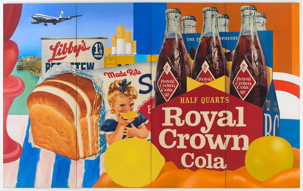
Still Life #35, by Tom Wesselmann 1963
Still Life #35 Background
The medium used for this piece are oil and collage on canvas. This painting according to Artsy, is an iconic work of the 1960's that fully defines the characteristics of Pop art. Pop art consciously moved "away from the Abstract Expressionism of the 1950's" It embraced "cultural specificity"(Artsy). Looking at this painting the audience knows "this is an image of mid-20th century America"(Artsy). However, it references "traditional European still life" as we learned earlier it is a depiction of "commonplace objects - fruit, vegetables, or flowers - in a manner that highlighted their unique beauty"(Artsy). In this piece Wesselmann shows Royal Crown cola, a loaf of white bread, canned stew, and a packet of cigarettes. All of these objects are vibrantly made and the audience knows these are mass produced items or familiar branded items. On the left, a window "affords us a view of a commercial jet soaring over an emerald sea against a clear blue sky"(Artsy). Almost all of the goods are "cheap, generic foods, manufactured and packaged with distinct branding and logos"(Artsy). Wesselmann created an image that is a "literal feast for the eyes, this painting allows us to indulge in the fantasy that all these things taste as good as they look"(Artsy).
Smoker #17 Background
Wesselmann started drawing the series Smokers in the late 1960's and then created a more complex version in the 1970's. Wesselmann was inspired by the "sensuality in the juxtaposition of the smoke wafting out of the mouth"(Sothebys). The appeal of the movement of "smoke from behind bright red lips was considered "pure sensuality, rhythmic curves and soft lines"(Sothebys). Wesselmann highlights the moment in time as the "half-open mouth, the sparkle of lipstick, the scarlet gleam of the nail varnish on the solitary hand holding the rigid cigarette, all caressed and obscured by soft, translucent spirals of smoke"(Sothebys). He didn't introduce "hands and elaborate smoke patterns to his series in the mid-seventies"(Sothebys). It was "merging and separating these individual elements to create a more intricate compositional structure and more complex designs"(Sothebys).
Tom Wesselmann Aesthetic
I love Tom Wesselmann's use of color in the painting Still Life #35. The primary colors pop and work well with the neutral colors of the color and bread crust to make them stand out as well. I also love this vibrant take of still life. It is inviting and looks much like an advertisement in a magazine or billboard. I think the aim was less emotional and more commercialized from the use of logos. I love the immense detail found in this painting. My favorite would have to be the beads of condensation on the cola. It looks so real that I literally wanted to try this cola. It looked very realistic as well as the plastic wrapping of the bread. the lines aren't too bold or ridged but used more to create sharp lines in the shapes of the cola container and background.
In Smoker #17, I found this painting very interesting. what Wesselmann in a way accomplished is the perfect moment in time where smoke is coming out of the woman's mouth, There isn't a lot of colors in this painting, and it truly does not need it. The smoke up against the red lip is a beautiful contrast. He created the smoke to look less on the opaque side and more heavy in some areas, while hinting at the upper part of the woman's hand. It's as if the smoke is flowing with her hand. The lips are well detailed with the red lipstick that has a gloss to it which he used white to highlight the lips. the nails are a slightly different red color than the lips and are highlighted with white to show the shine. Her teeth aren't perfectly white they have a tinge of that nicotine color to them which makes it more realistic.
Thank you for this wonderfully detailed post. To be honest, the appeal of Pop Art has been lost on me, but your thorough analysis and obvious passion for the style has made me reconsider my stance. I am particularly interested in viewing more works by Wesselmann as I genuinely enjoyed the pieces that you selected. Like you, I enjoyed the bold color choices for "Still Life #35". The placement of modern brands and images presented in a traditional form like the still life is refreshing and challenges the notion that art must remain somehow inaccessible to the masses in order to be art, which seems to be a consistent theme in Pop Art. I was also struck by the choice to include cigarettes since many of the classic still life paintings featured skulls to represent the ever present nature of death in every facet of our lives and I wonder if Wesselmann made that choice deliberately?
Hello! What I love about your blog is how you specifically look and describe the details. As I read your writing, it gave me more insights on the art works presented. My favorite from all of the artwork that you presented is from Roy Lichtenstein, the Drowning Girl. I like this because although I did not see any shading, there are still emphasis on the subject. Also, the artist used few colors, yet it still look really good. This kind of artwork style seems to be usually printed and posted as propagandas after World War II. Here are more art works that similar to this: https://www.allposters.com/-st/World-War-II-Propaganda-Vintage-Art-Posters_c50710_.htm

.jpg)

 Smoker #17 Background

Hi Kat,
ReplyDeleteThank you for this wonderfully detailed post. To be honest, the appeal of Pop Art has been lost on me, but your thorough analysis and obvious passion for the style has made me reconsider my stance. I am particularly interested in viewing more works by Wesselmann as I genuinely enjoyed the pieces that you selected. Like you, I enjoyed the bold color choices for "Still Life #35". The placement of modern brands and images presented in a traditional form like the still life is refreshing and challenges the notion that art must remain somehow inaccessible to the masses in order to be art, which seems to be a consistent theme in Pop Art. I was also struck by the choice to include cigarettes since many of the classic still life paintings featured skulls to represent the ever present nature of death in every facet of our lives and I wonder if Wesselmann made that choice deliberately?
Hello! What I love about your blog is how you specifically look and describe the details. As I read your writing, it gave me more insights on the art works presented. My favorite from all of the artwork that you presented is from Roy Lichtenstein, the Drowning Girl. I like this because although I did not see any shading, there are still emphasis on the subject. Also, the artist used few colors, yet it still look really good. This kind of artwork style seems to be usually printed and posted as propagandas after World War II. Here are more art works that similar to this: https://www.allposters.com/-st/World-War-II-Propaganda-Vintage-Art-Posters_c50710_.htm
ReplyDelete